– Below is bit of the process of putting this project together –
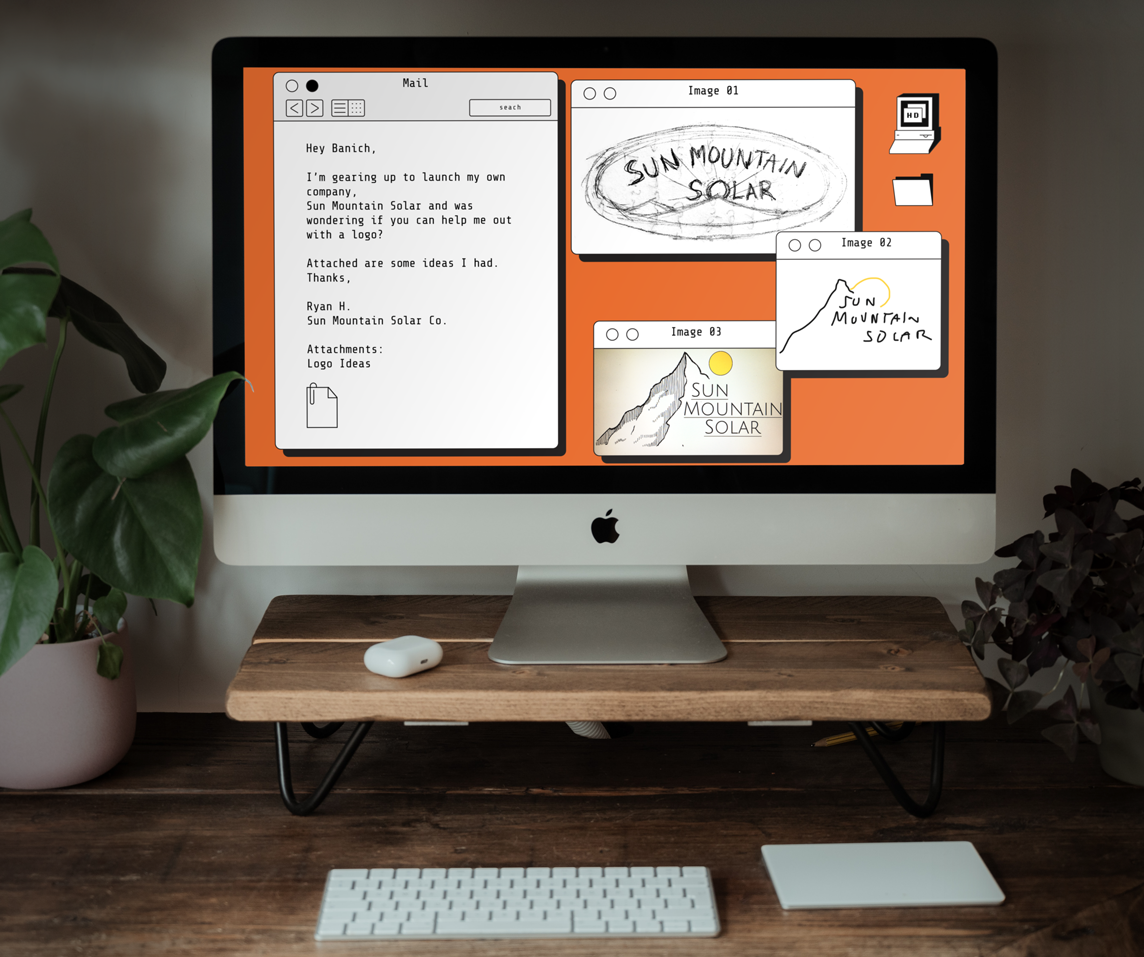
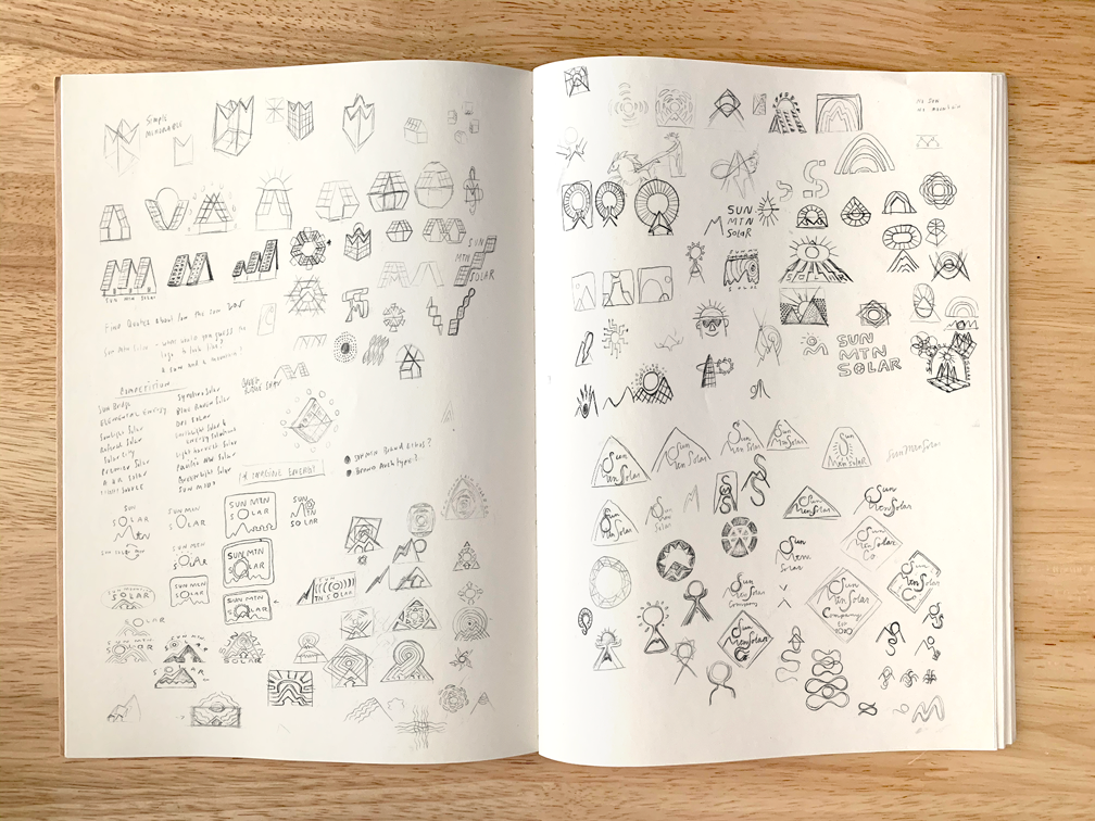
Usually, I'll get an email asking for a logo. In this case, Ryan had some sketches he had made illustrating what he was thinking. I sent him off a questionnaire on him, his business, and other questions to gain insight on how to make the logo for his business more unique to him and the company.
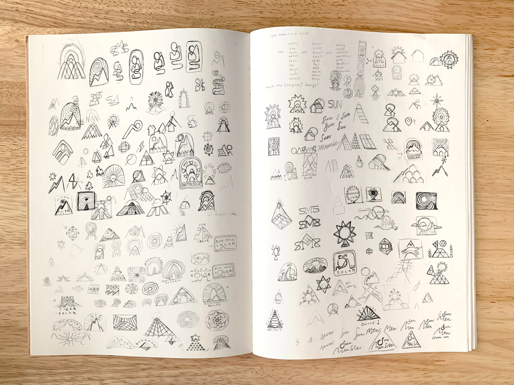
I usually with start thinking about and sketching immediately and once the questionnaire comes back pivot in any necessary direction. While I don't ignore anything sent to me, I try to use my skills to create the most unique and memorable mark I can.
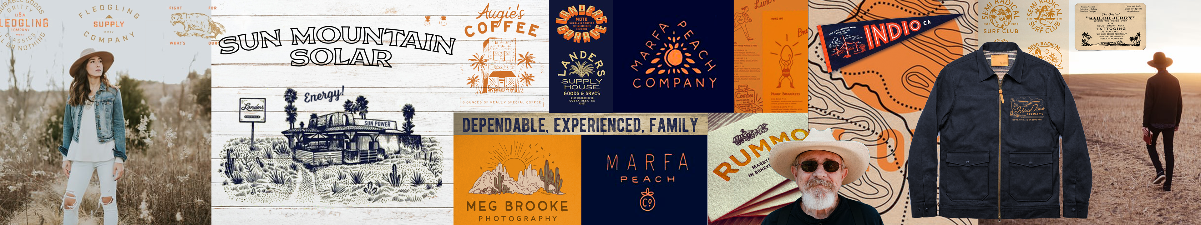
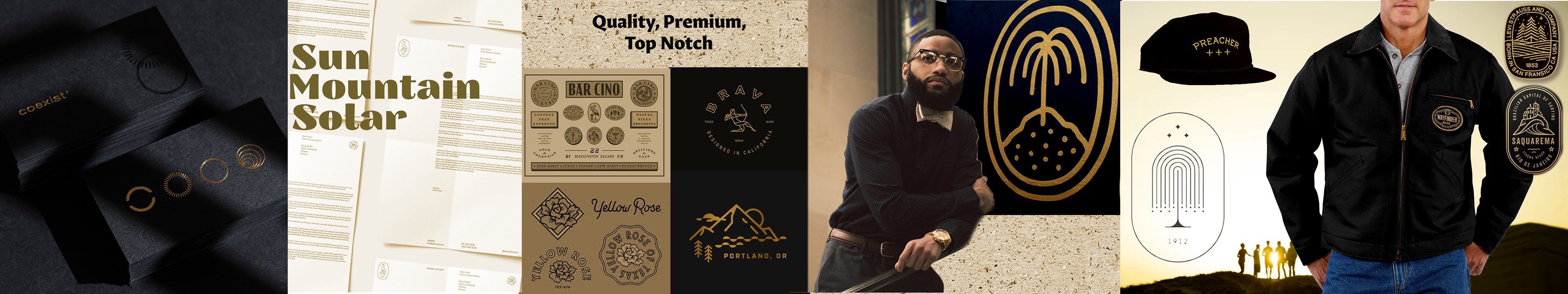
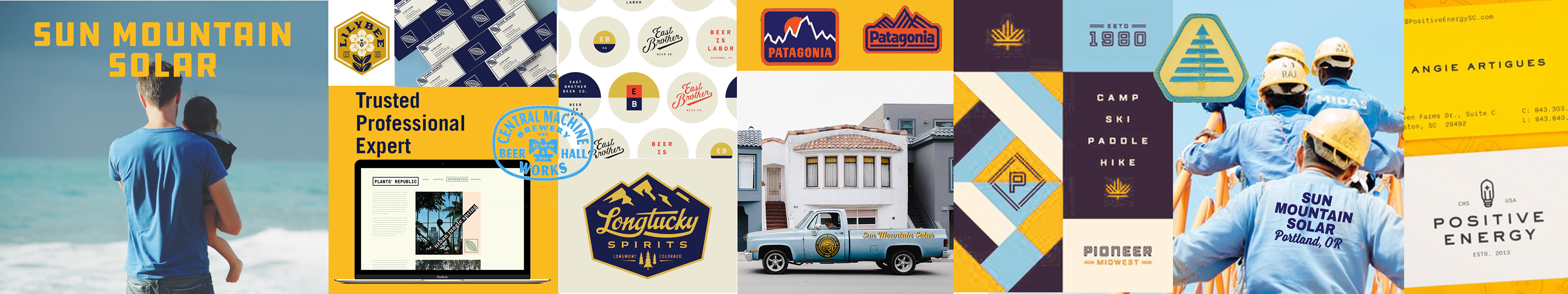
For this particular project, I went a little bananas with the Mood Boards. I had watched an episode of The Futur on Youtube on brand design, and they put together these very amazing "styles capes". I really dug that approach and wanted to try it out. In the end, I think I showed too much and overwhelmed the client.
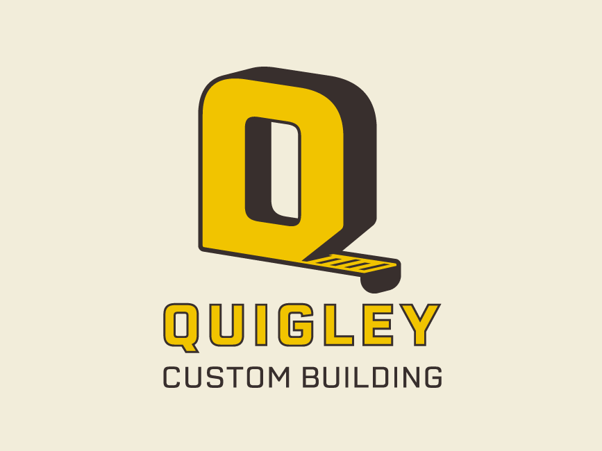
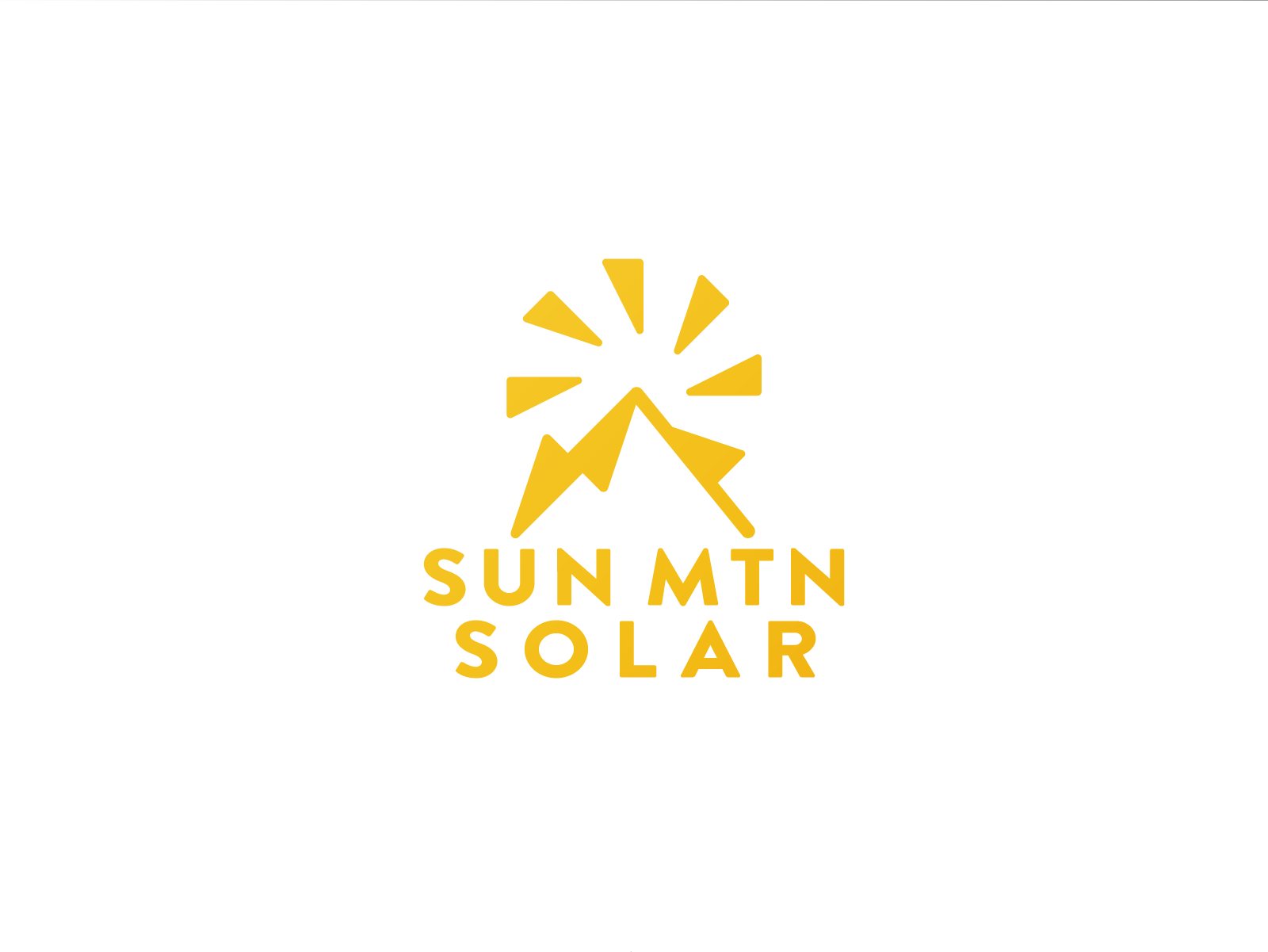
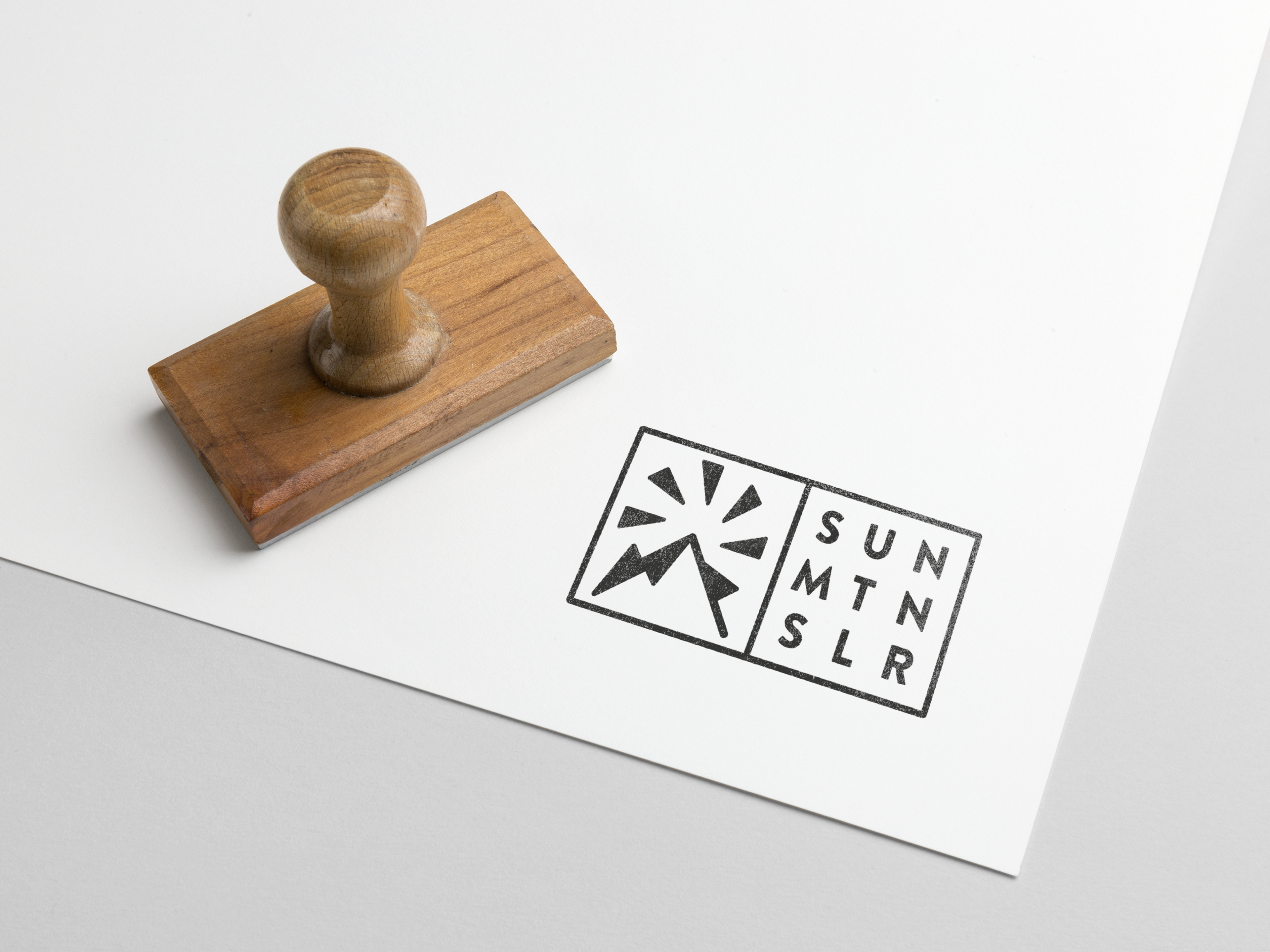
I created 4 directions based on styles I would be excited to create for him once I had the questionnaire back. 1. a vintage, hand drawn approach to highlight the family aspect of his startup. 2. An upscale, high-end service look. 3. A bold, utilitarian look, and 4. the wildcard, a more earthy and organic option. While all the boards were well received, #3 was favored the most.
Round 1 / 3 Logo Directions
Direction 1
Direction 2
Direction 3
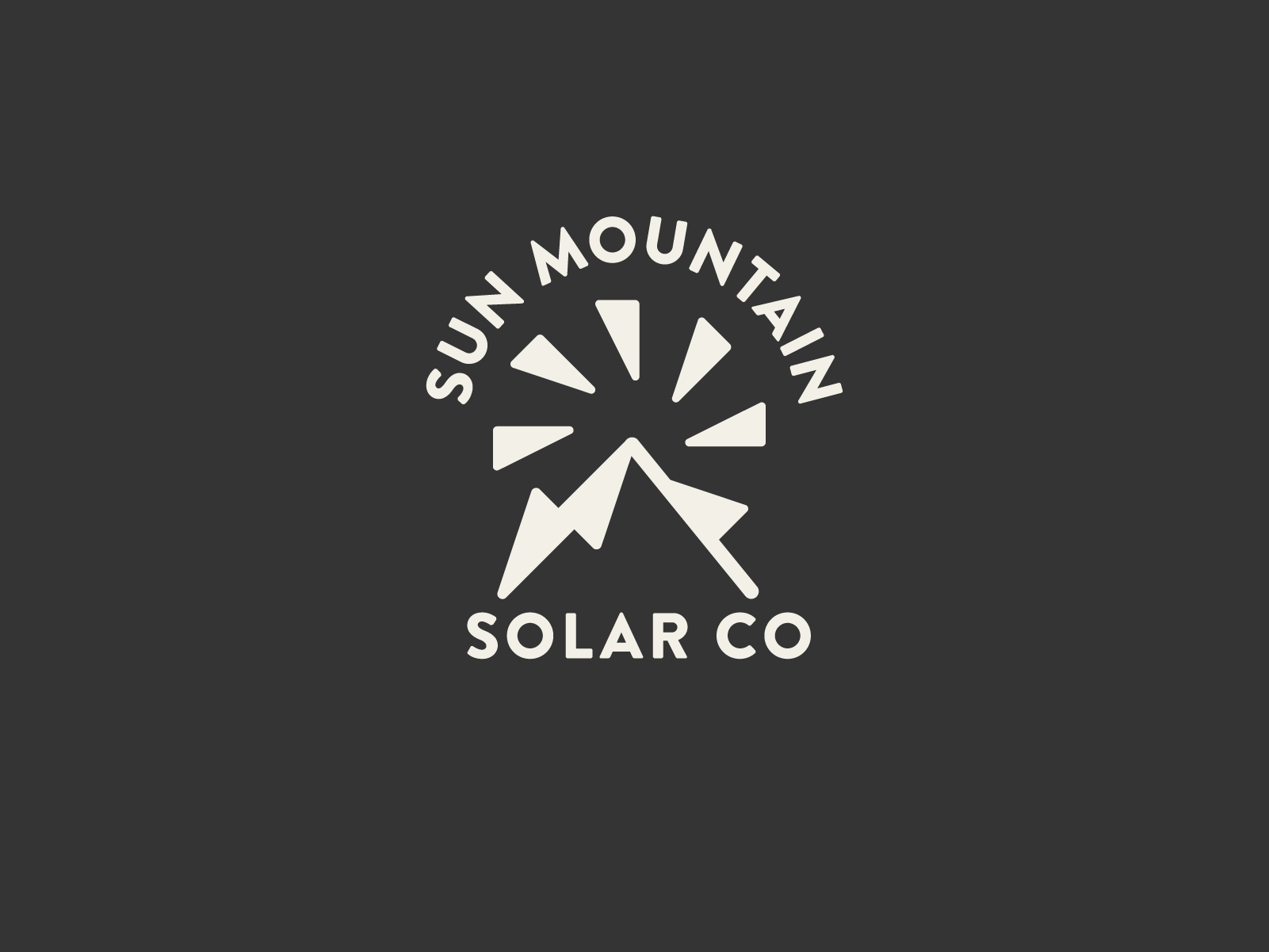
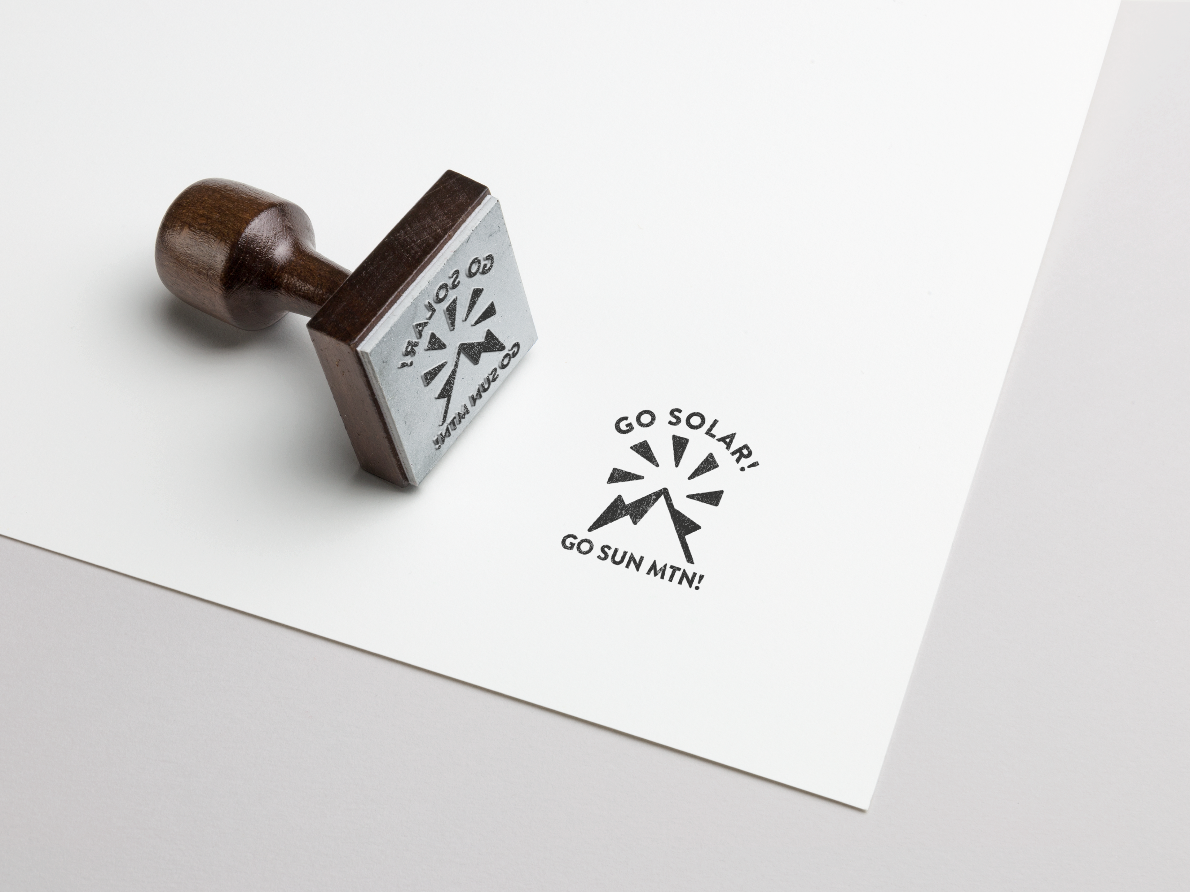
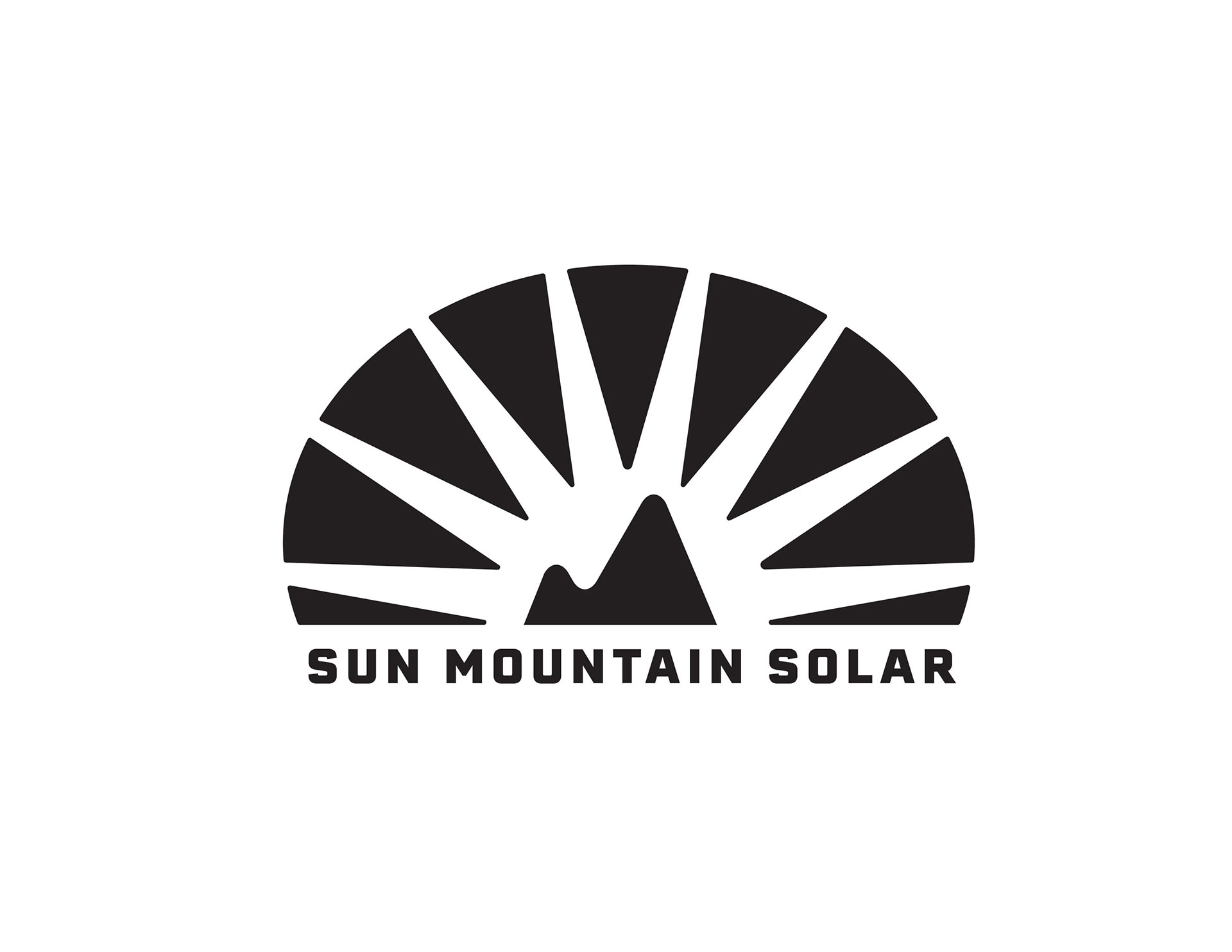
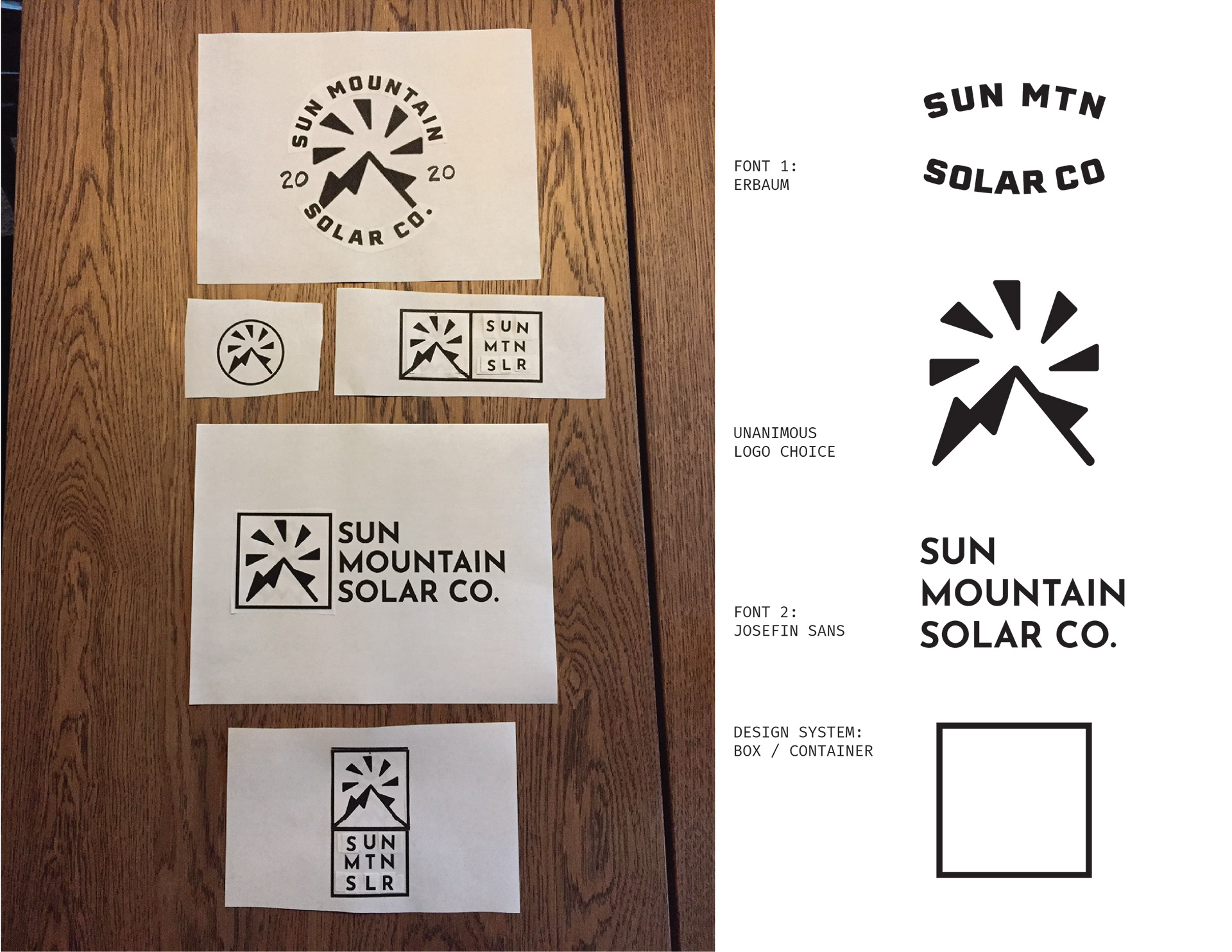
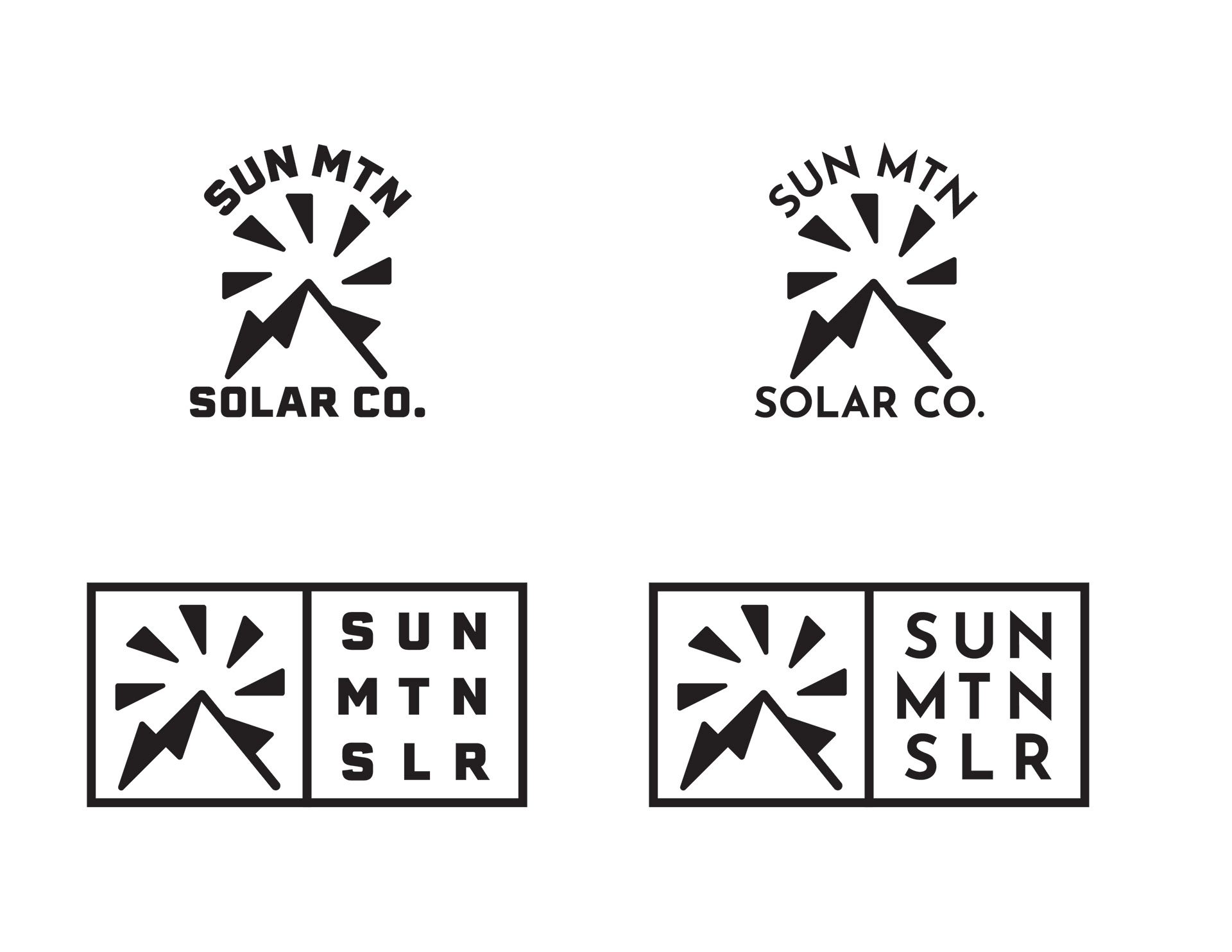
The feedback on this first round was very positive and we were real close. The middle mark (Direction 2) was the unanimous choice, but the client preferred the other typefaces. I. felt like the typeface from the first direction: Josefin Sans was a better pairing with direction 2's mark but it was too sharp to pair with the rounded edges of that logo.
Client feedback
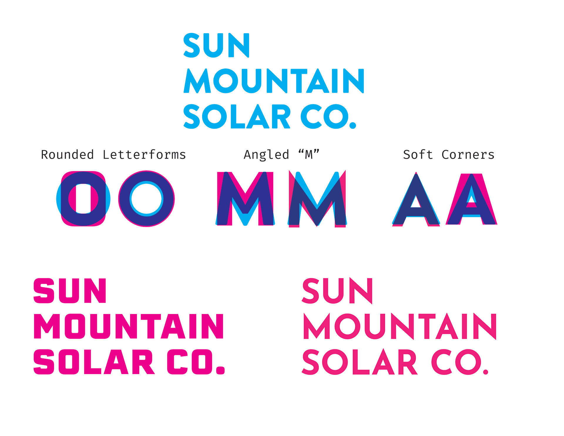
Typefaces & Logo are a mismatch
Finding a solution
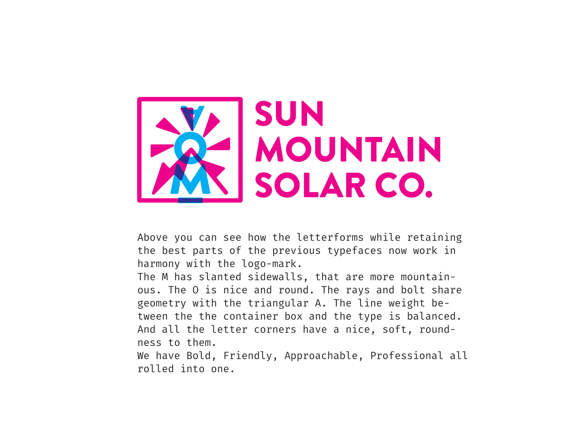
Why it works
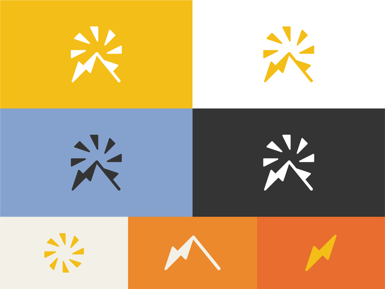
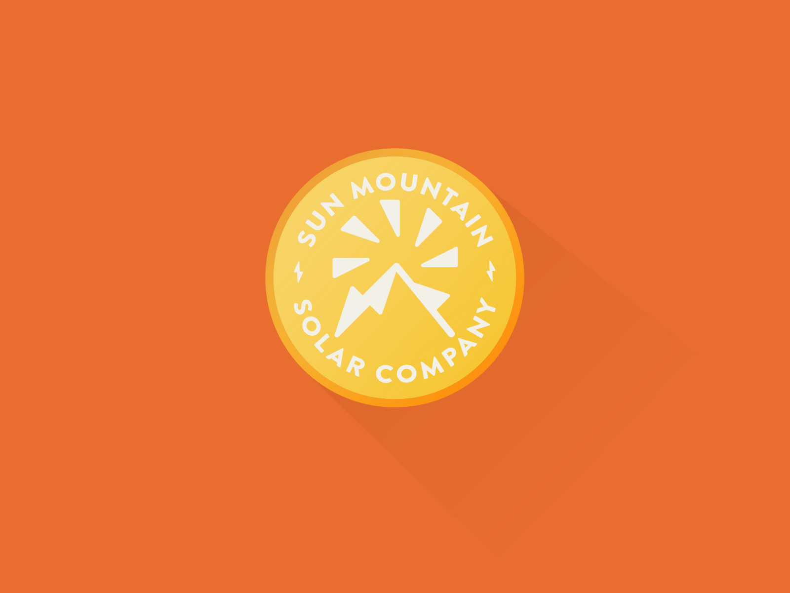
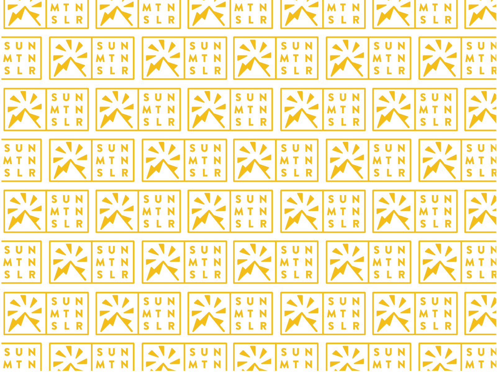
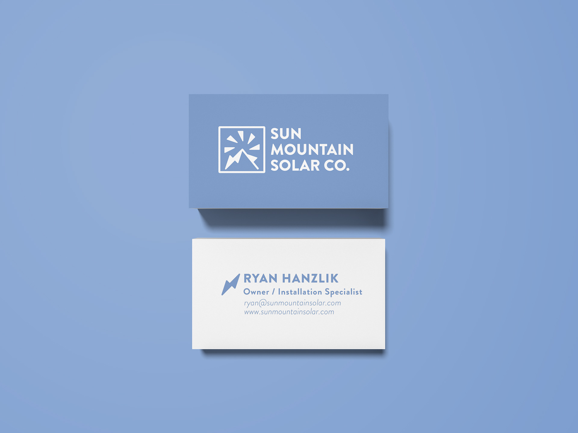
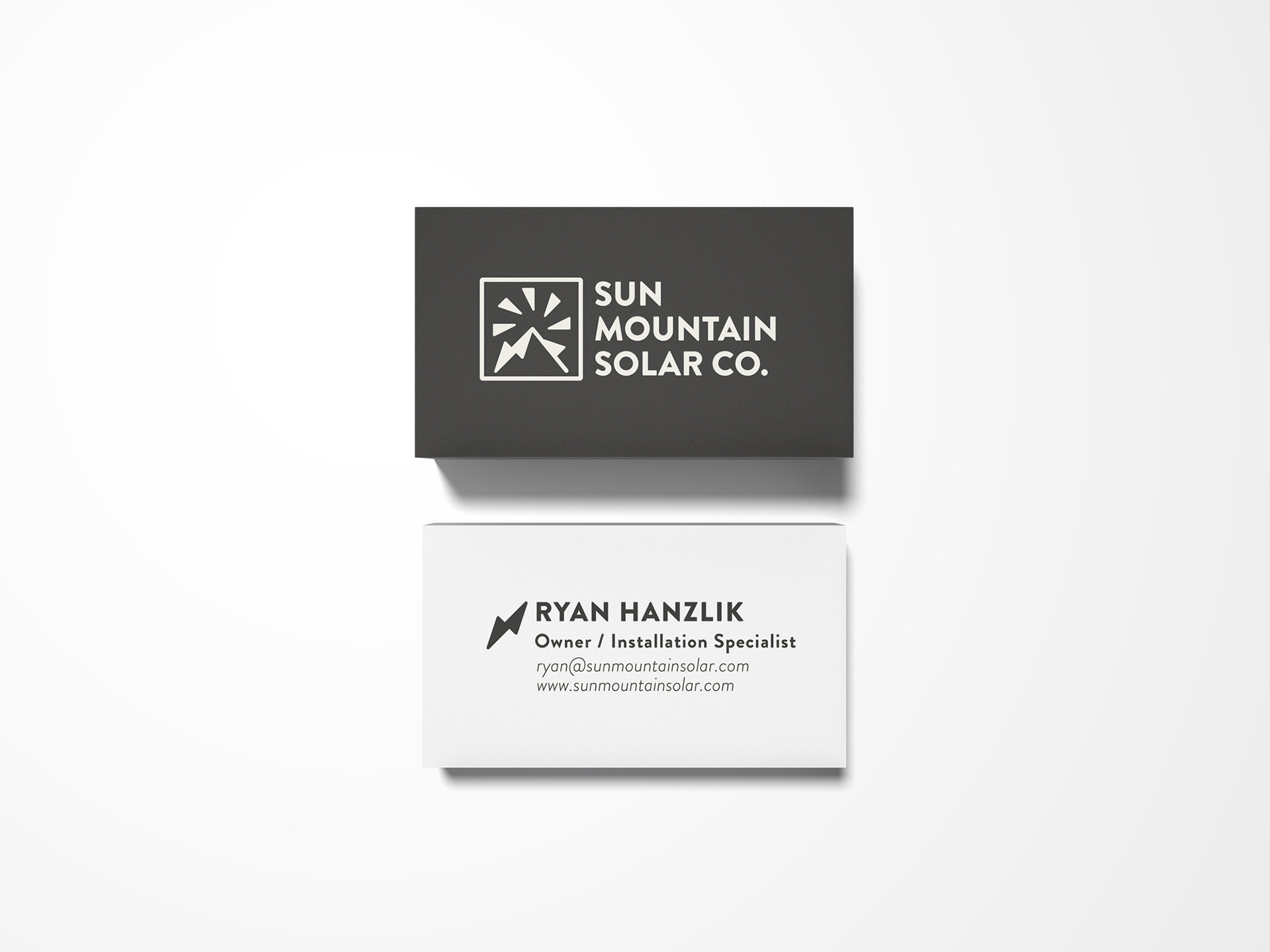
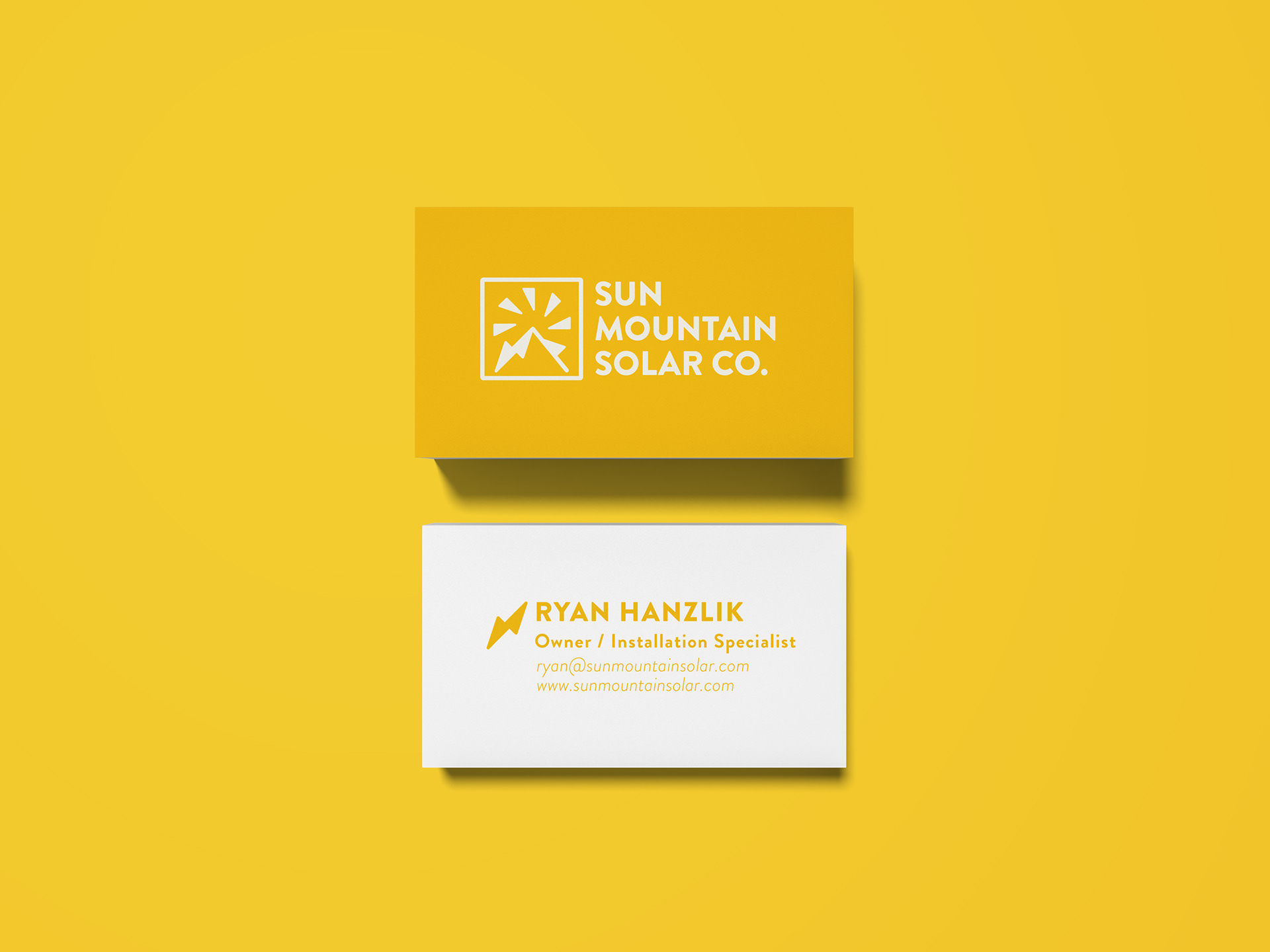
The feedback (on the left) was a collage of what was liked from the first round samples. I paired the two liked typefaces with the chosen logo and broke down why they didn't work together. Then presented a solution in the form of a different typeface that was similar to Josefin Sans but had characteristics that made it a much better pairing for the logo. That small yet massive change was enough to approve our logo. From here I developed a color palette and put together a few lockups for different usages.
If you're in need of a logo, drop me a line.